Watch How 3 Stocks Are Changing Their Trend Directions
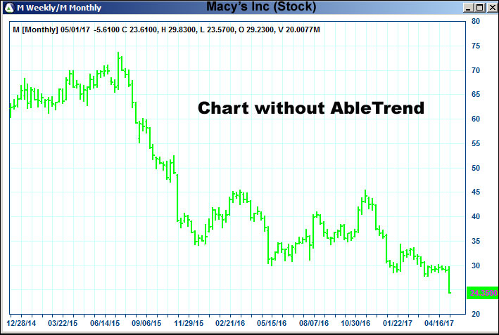
For swing trading stocks you probably would pay more attention to the long-term directions. It’s getting popular to use AbleTrend’s guidance chart to find trend direction changes. Daily/weekly guidance chart or weekly/monthly guidance chart are the most widely used. Following is a weekly chart for Macy’s stock (M) without AbleTrend.
Following is the same Macy’s chart with AbleTrend Weekly/Monthly Guidance Chart applied.
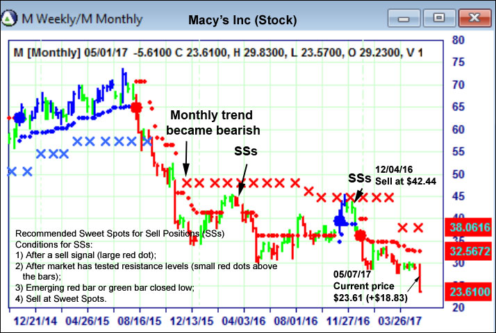
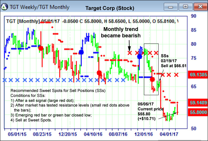
This is a weekly chart; each bar represents the price of the week. Large blue dot is a buy signal and large red dot is a sell signal. Blue bars indicate an uptrend and red bars indicate downtrend. A hidden monthly chart is applied and blue X is the market support levels based on the monthly chart; and red X is the market resistance levels based on the monthly chart. There are two levels of confirmation when the uptrend switched to the downtrend: First when the weekly large red dot and red bar broke the blue X, the monthly support level, we know the long term monthly support level has broken, therefore the uptrend is finished. Second, the red X showed up further confirming the trend direction from uptrend to downtrend is completed. Once trend direction change is confirmed, it’s the time to look for sweet spot to sell.
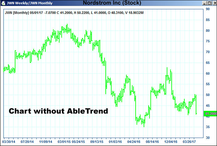
Following is the weekly chart for Nordstrom stock.
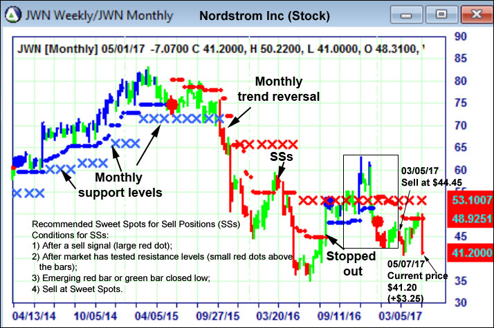
The same Nordstrom stock chart, but with AbleTrend Weekly/Monthly Guidance Chart applied.
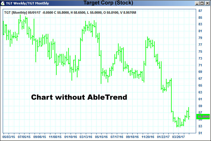
Following is a weekly chart with Target stock.
The same Target stock chart, but with AbleTrend Weekly/Monthly Guidance Chart applied.
To learn what the Sweet Spot looks like and how to find more of them, and how these trades evolved in the recent trades, visit our Trade Setups and Outcomes examples.
With Warm Regards
Grace Wang
AbleSys Corp.
Gracezh@ablesys.com
Leave a Reply
You must be logged in to post a comment.